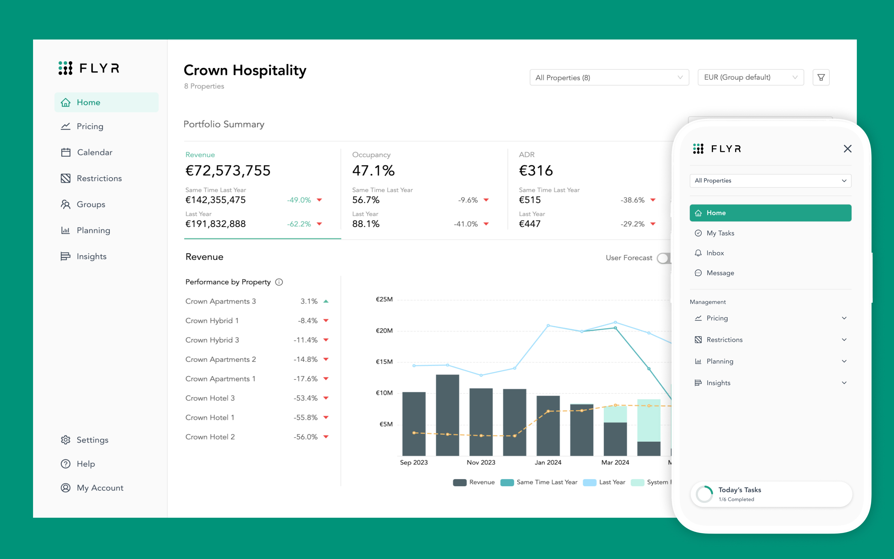
FLYR Hospitality - 2025 Platform Revamp and Design System

Date

Jul 2024

Scope

Application Redesign

Problem Statement

Revenue managers and hospitality teams using FLYR for Hospitality (formerly Pace Revenue) needed a modern, consistent and accessible interface to effectively manage pricing strategies and maximize revenue.

Background

Following the acquisition and rebranding of Pace by FLYR in late 2023, the existing SaaS platform, though functionally solid, felt outdated, inconsistent and lacked the flexibility and scalability required for a modern product ecosystem. The templated UI, built on the ANT Design framework, limited branding cohesion and accessibility compliance and made it difficult for designers and engineers to implement updates efficiently.

My Role

Led the end-to-end redesign of the platform's UI
Aligning it with modern design standards, improved brand consistency across products and enhanced accessibility best practices for all users.
Architected a new scalable design system in Figma
Mapping every component, variable, and style to the ANT Design framework and implemented version control for efficient future updates.
Collaborated closely with engineering teams
Restructured the codebase, enabling support for theming, global UI management and seamless integration via React and Storybook.

Process

Research

• Audited the existing UI and codebase

• Analysed ANT Design constraints and opportunities

Ideation

• Explored theming and scalability with engineers

• Defined design principles and system goals

Design

• Built a modular design system in Figma

• Mapped components to ANT Design framework

Testing

• Validated components with designers & engineers

• Iterated based on real product use

Delivery

• Integrated system into Figma and Storybook

• Set up version control for ongoing updates

Challenges & Trade-offs

Balancing flexibility with framework limitations:
Working within the constraints of ANT Design required careful planning to ensure custom branding and accessibility needs could still be met. I learned how to extend a rigid system without breaking its core functionality.
Designing for scalability across teams:
Creating a system that served multiple product teams meant standardising components without limiting creativity. This taught me the value of modular design and strong documentation.
Bridging design and engineering:
Aligning the design system with the technical structure of React and Storybook involved close collaboration and frequent iteration. I gained deeper insight into front-end architecture and how to design with code in mind.

Outcomes

Increased design and development efficiency:
The new Figma design system and component library streamlined collaboration, reducing design-to-dev handoff time and minimizing rework across teams.
Improved consistency and scalability:
Product teams adopted a unified visual language, enabling faster feature development and more consistent UI patterns across the platform.
Positive stakeholder feedback:
Designers and engineers praised the new system’s clarity, flexibility, and ease of use. It became the foundation for ongoing product evolution post-acquisition.
Future-proofed design operations:
The introduction of version control and scalable architecture ensured the design system could evolve with the brand and support future product needs.
Available for hire
Contact me